Scope
Design System, Print, Packaging, Sub-branding, Positioning Guidelines, Final art
Jotex — Design System
Jotex is a leading Scandinavian interior design brand, dedicated to offering personal and authentic products that reflect each individual's unique style. The Jotex identity is rooted in modern design, bold expression, and a stripped-back Nordic aesthetic.
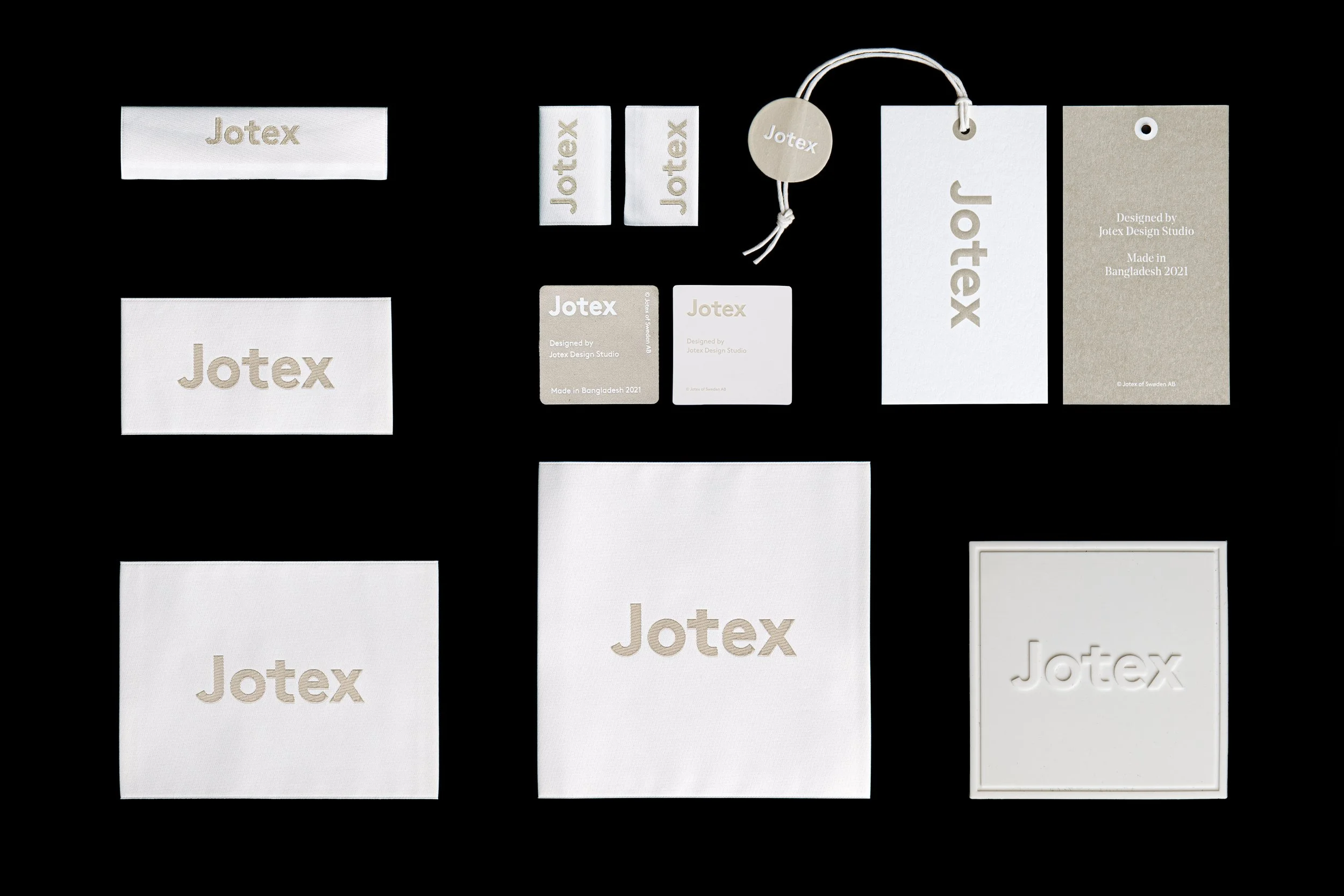
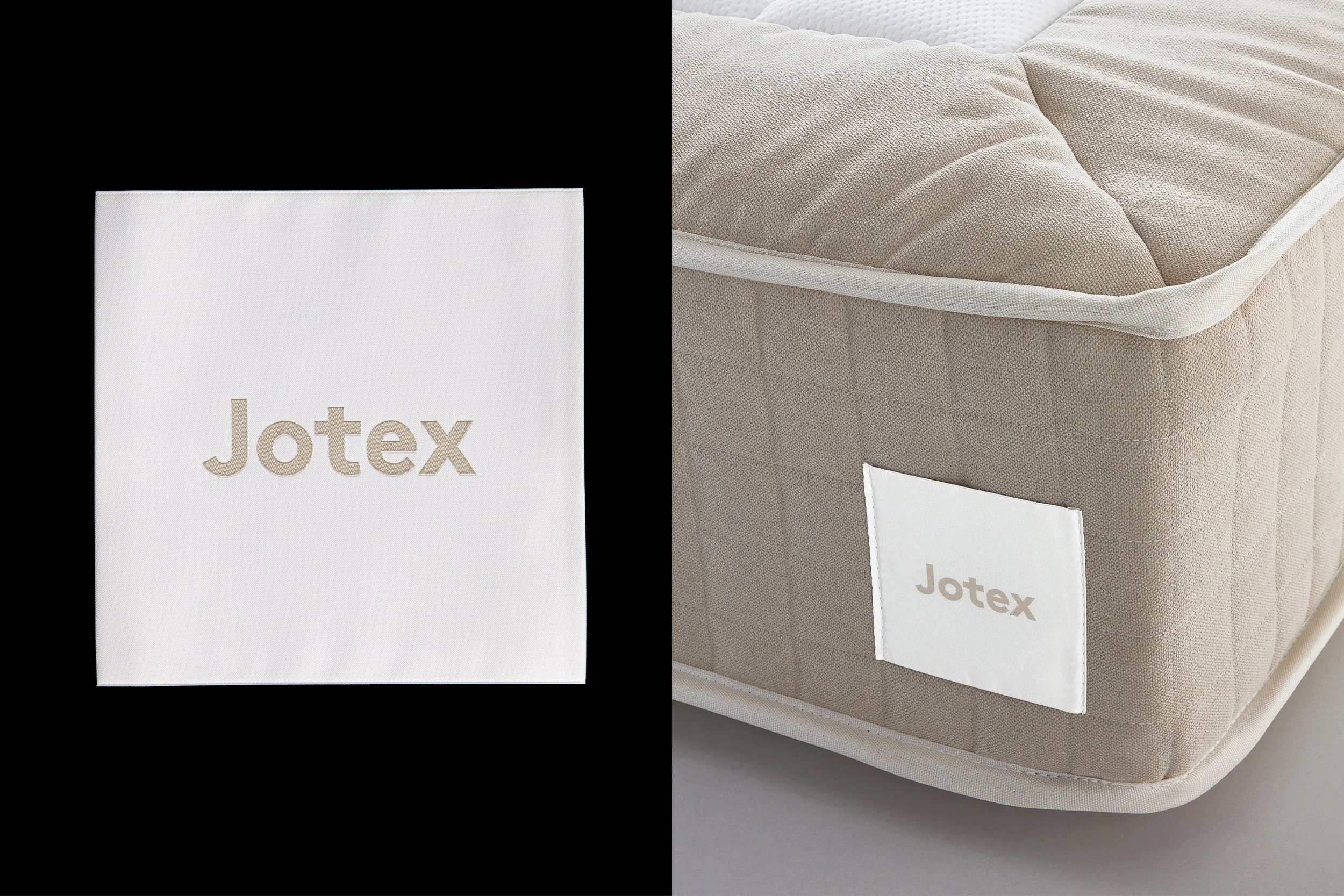
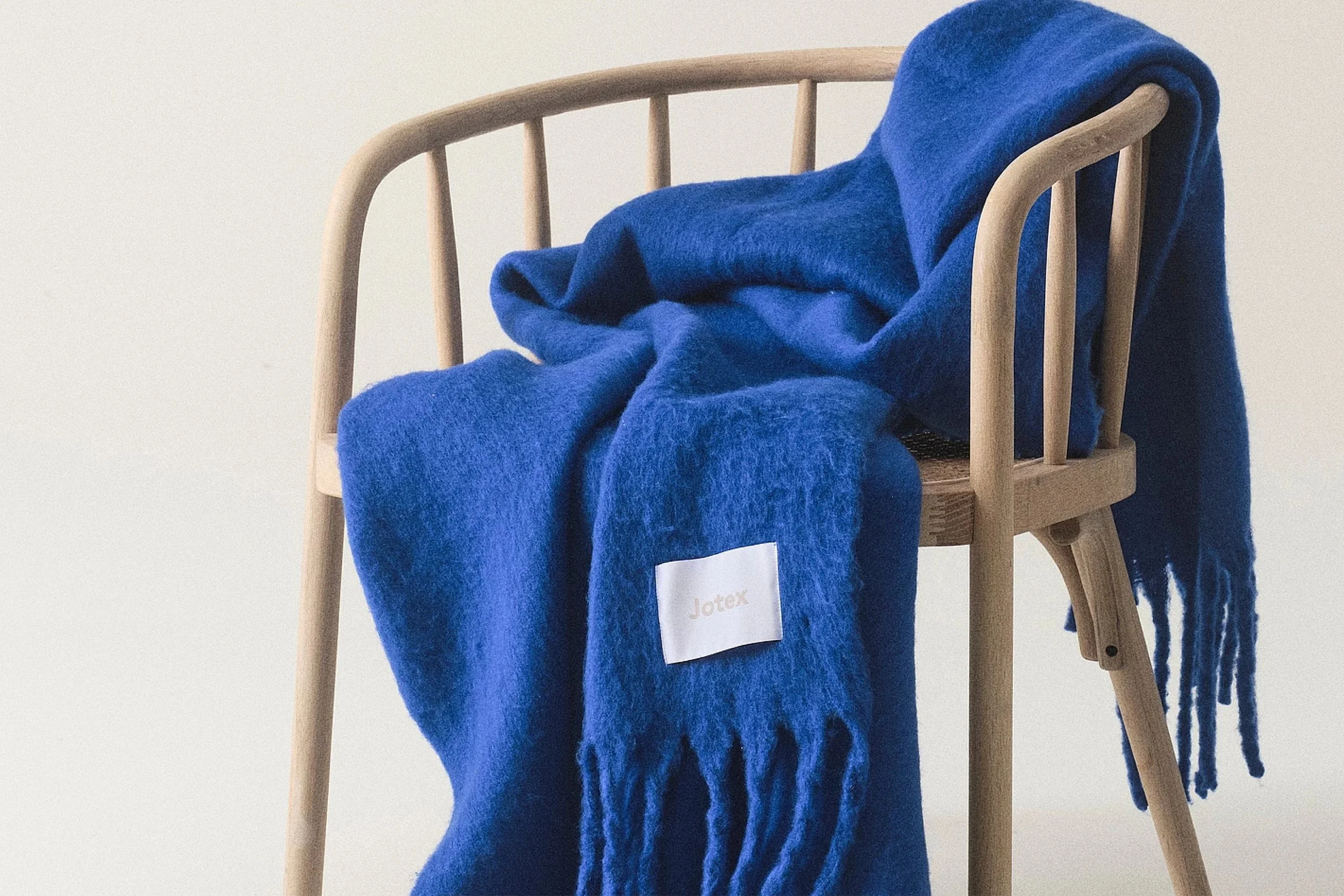
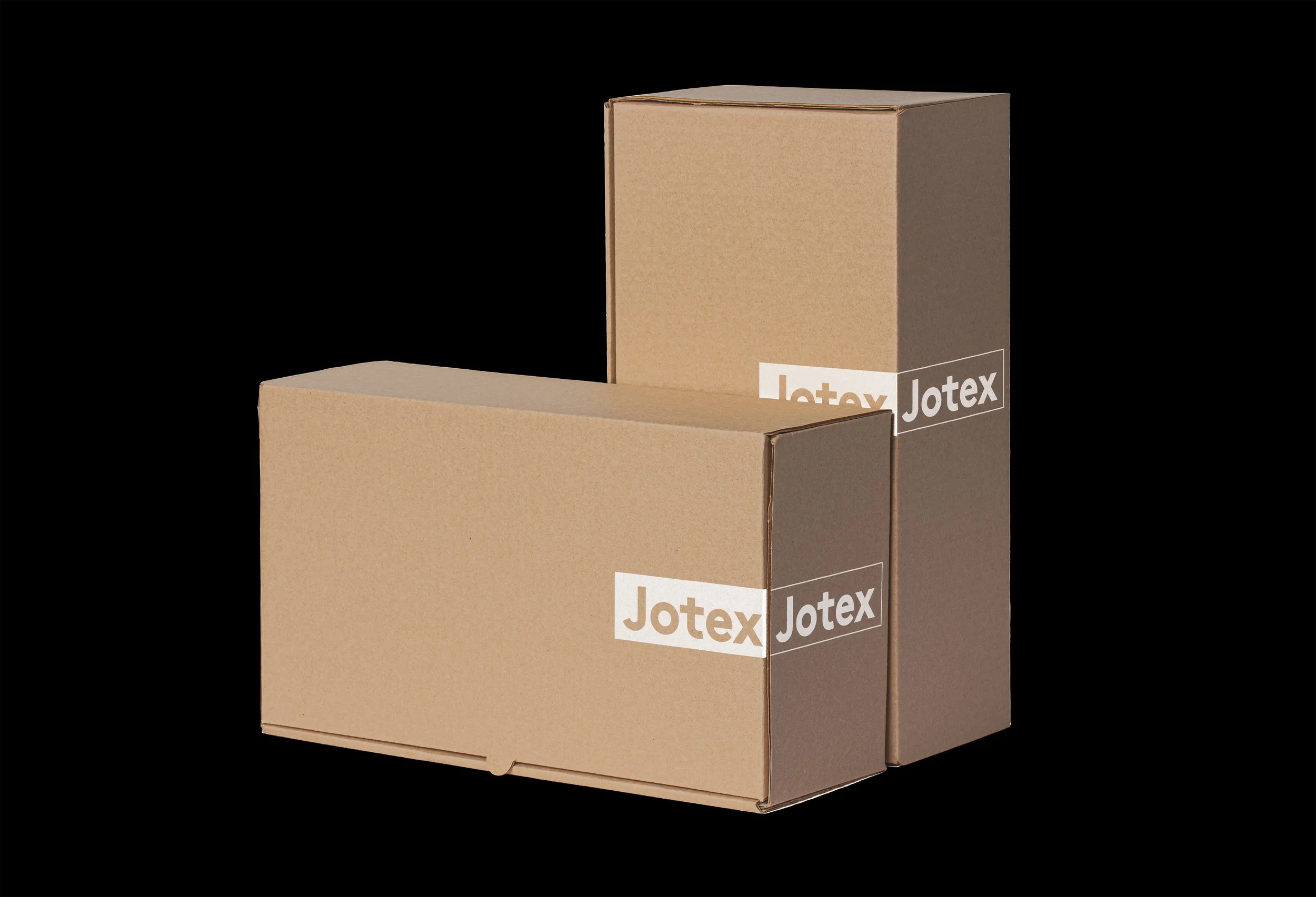
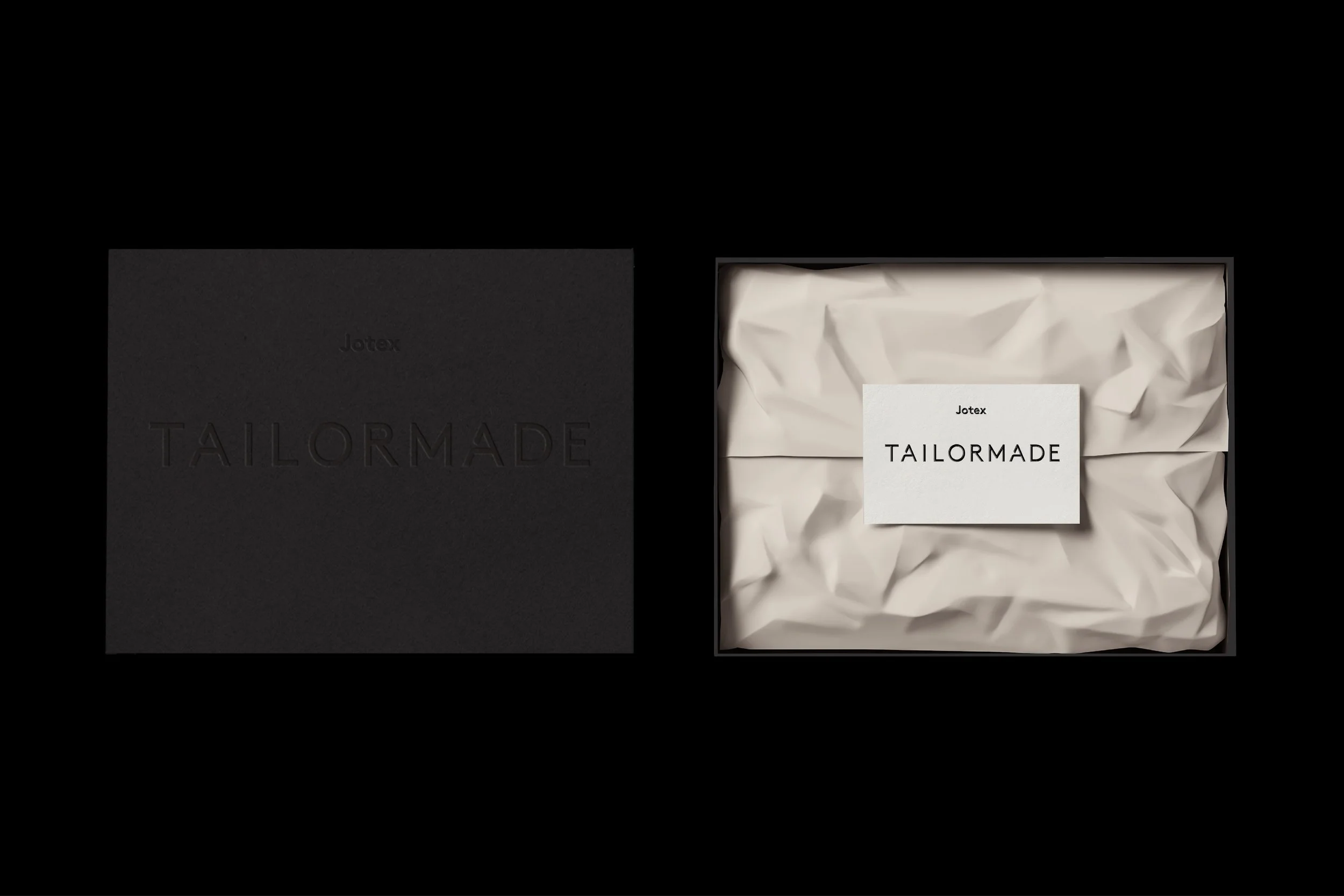
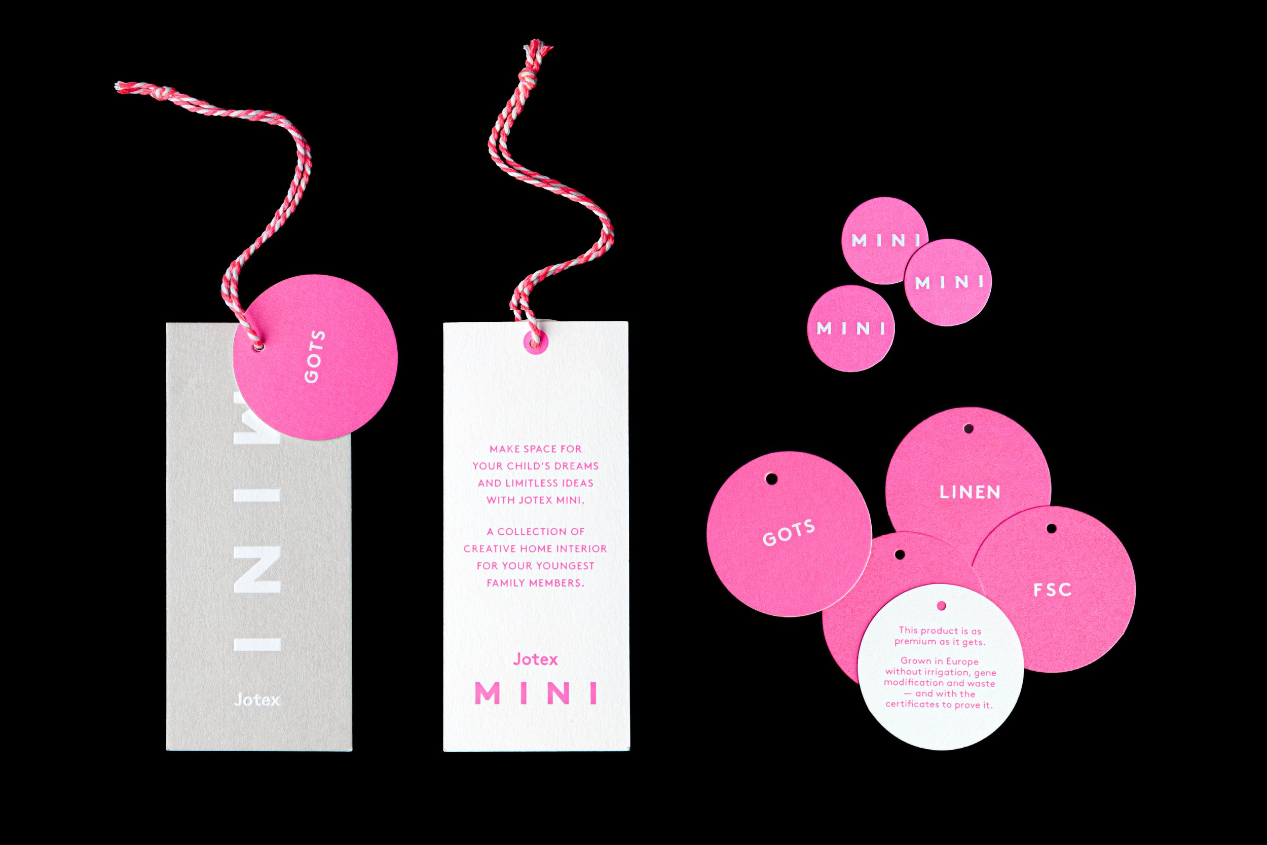
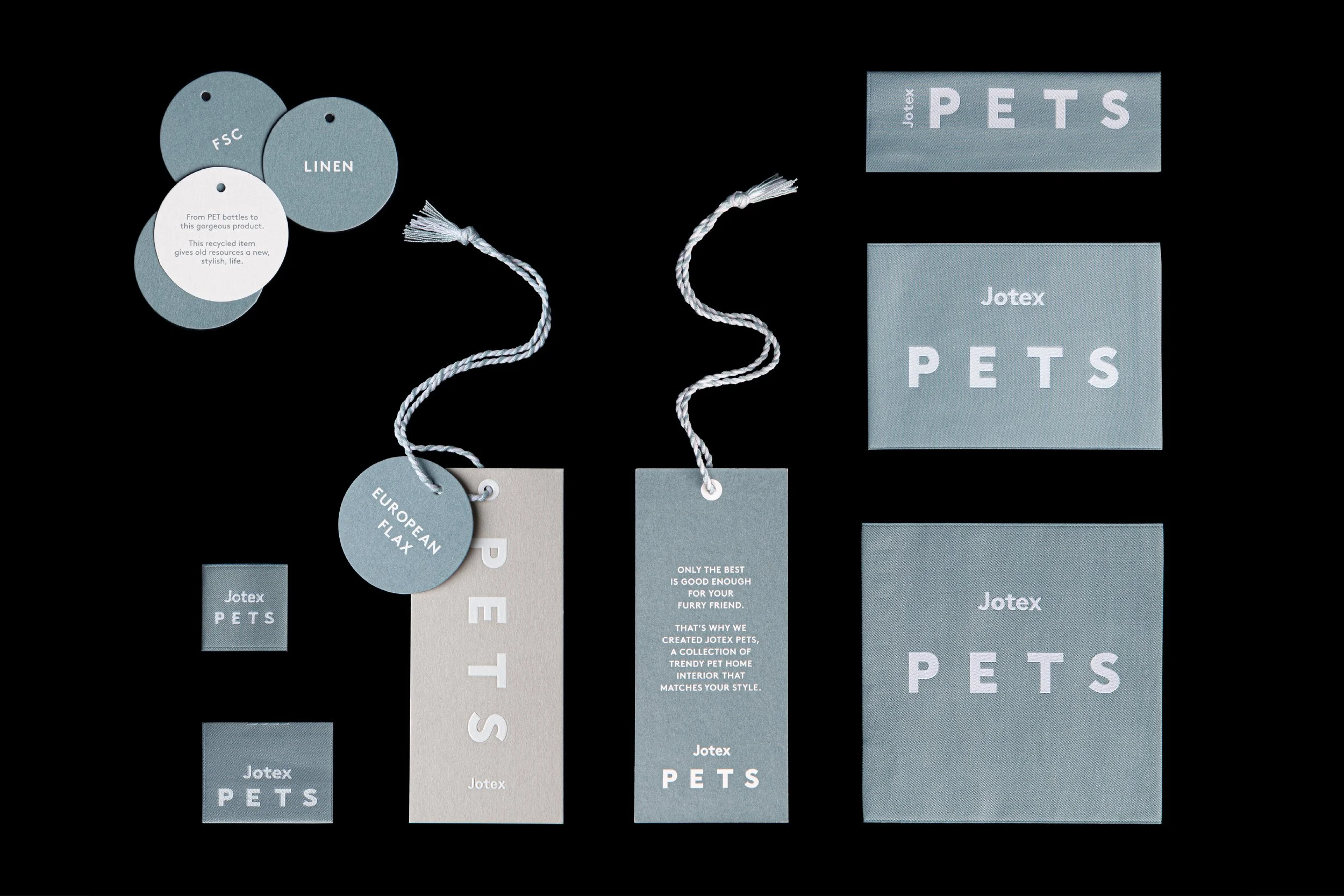
With an extensive product range, Jotex approached Studio Czarnecki to develop a comprehensive design system. This included branding and product labeling, material selection, printing techniques, sizing and placement, packaging solutions, and the creation of sub-brands under the larger Jotex umbrella.
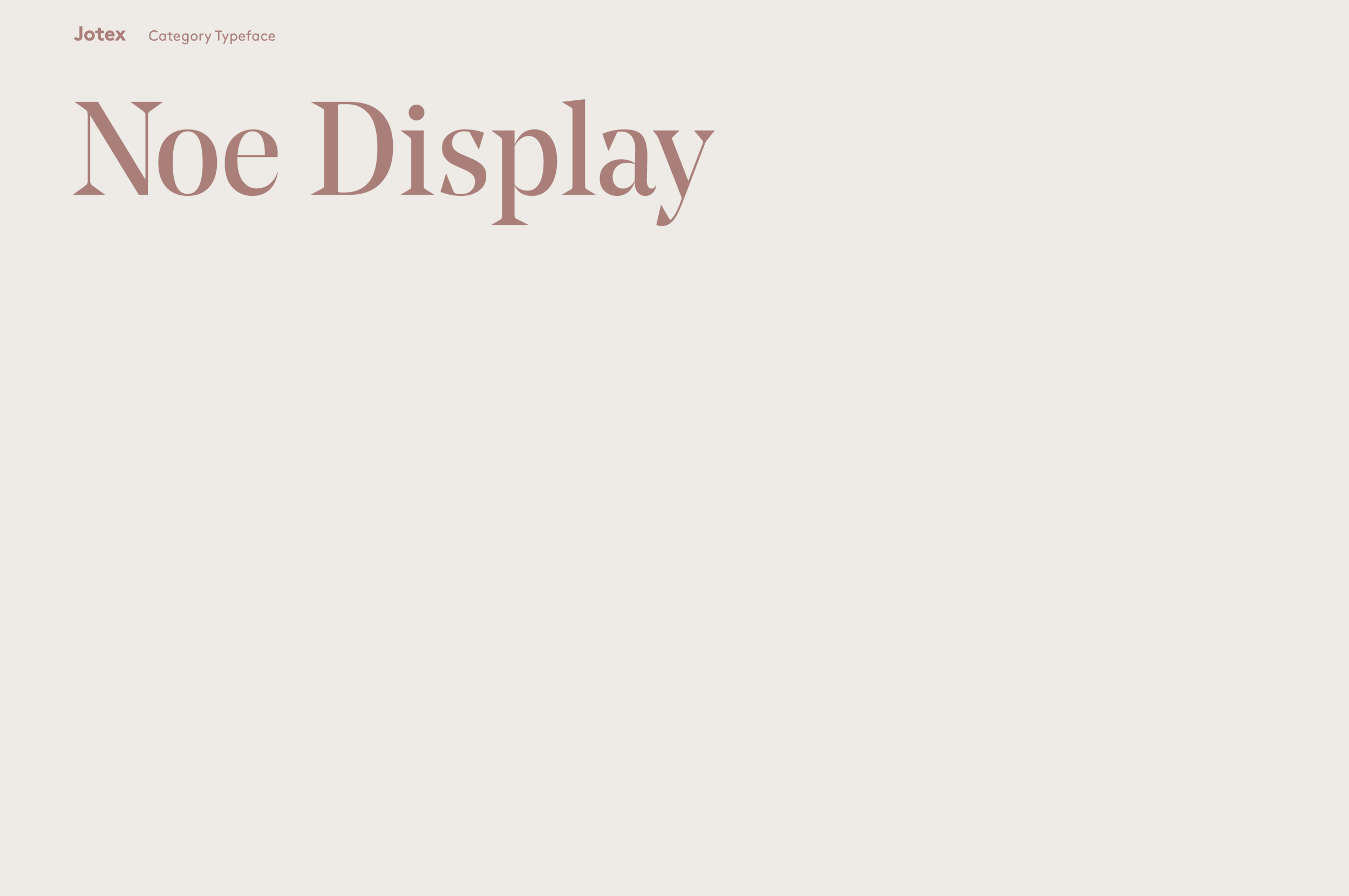
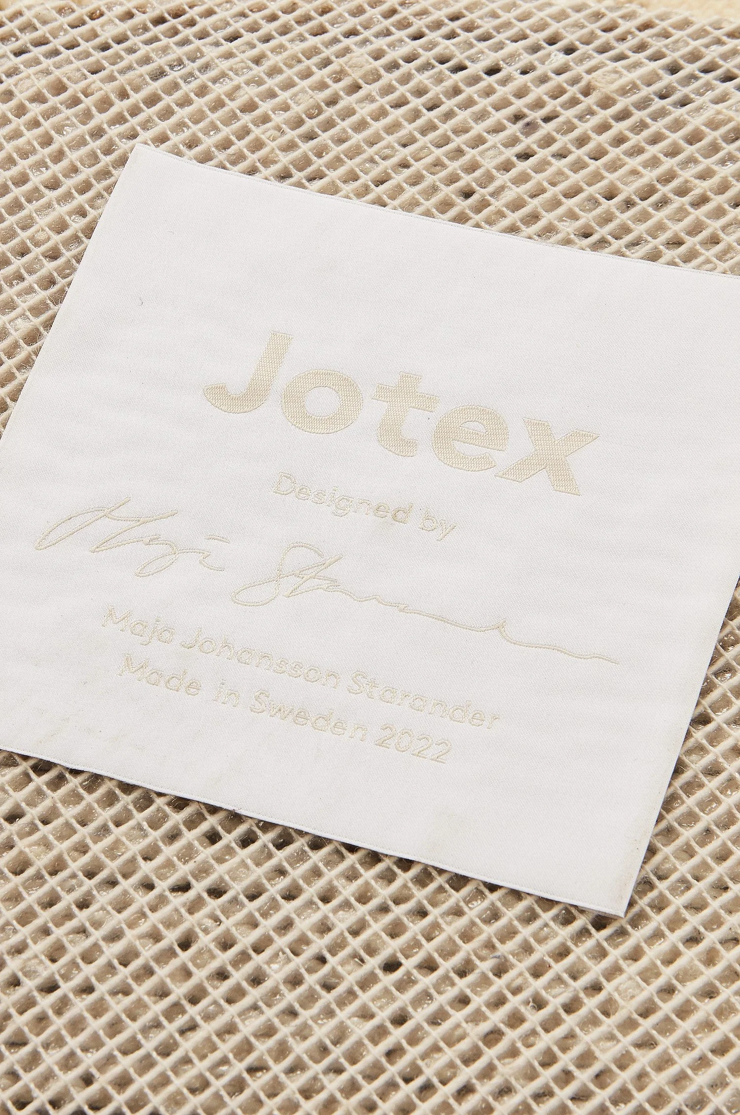
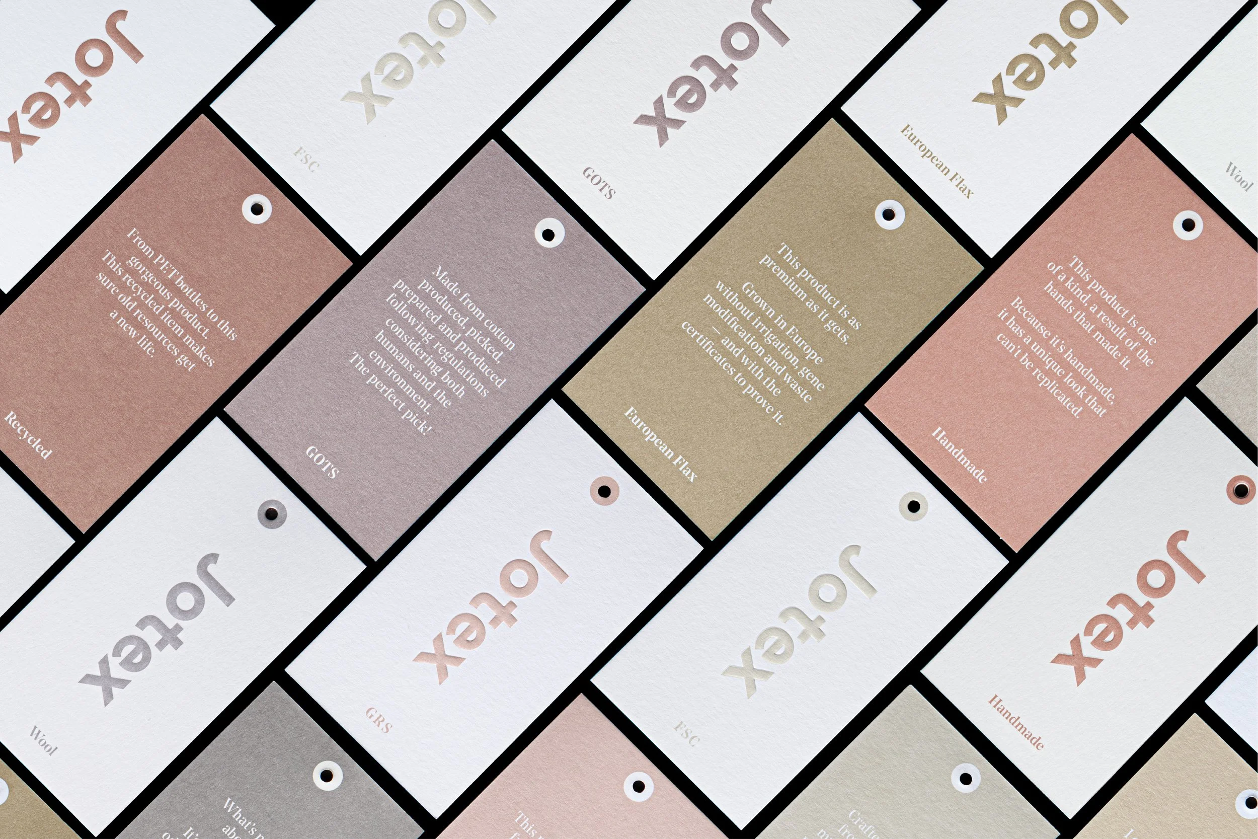
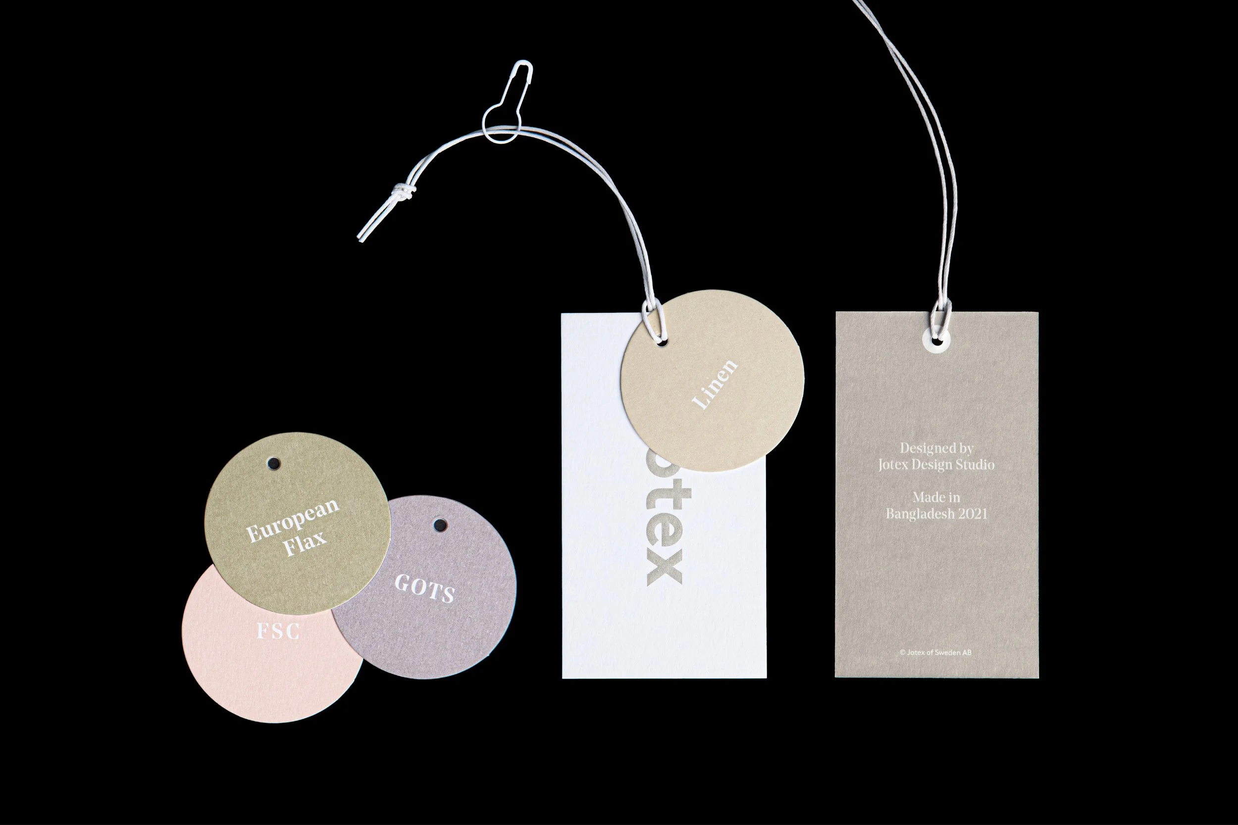
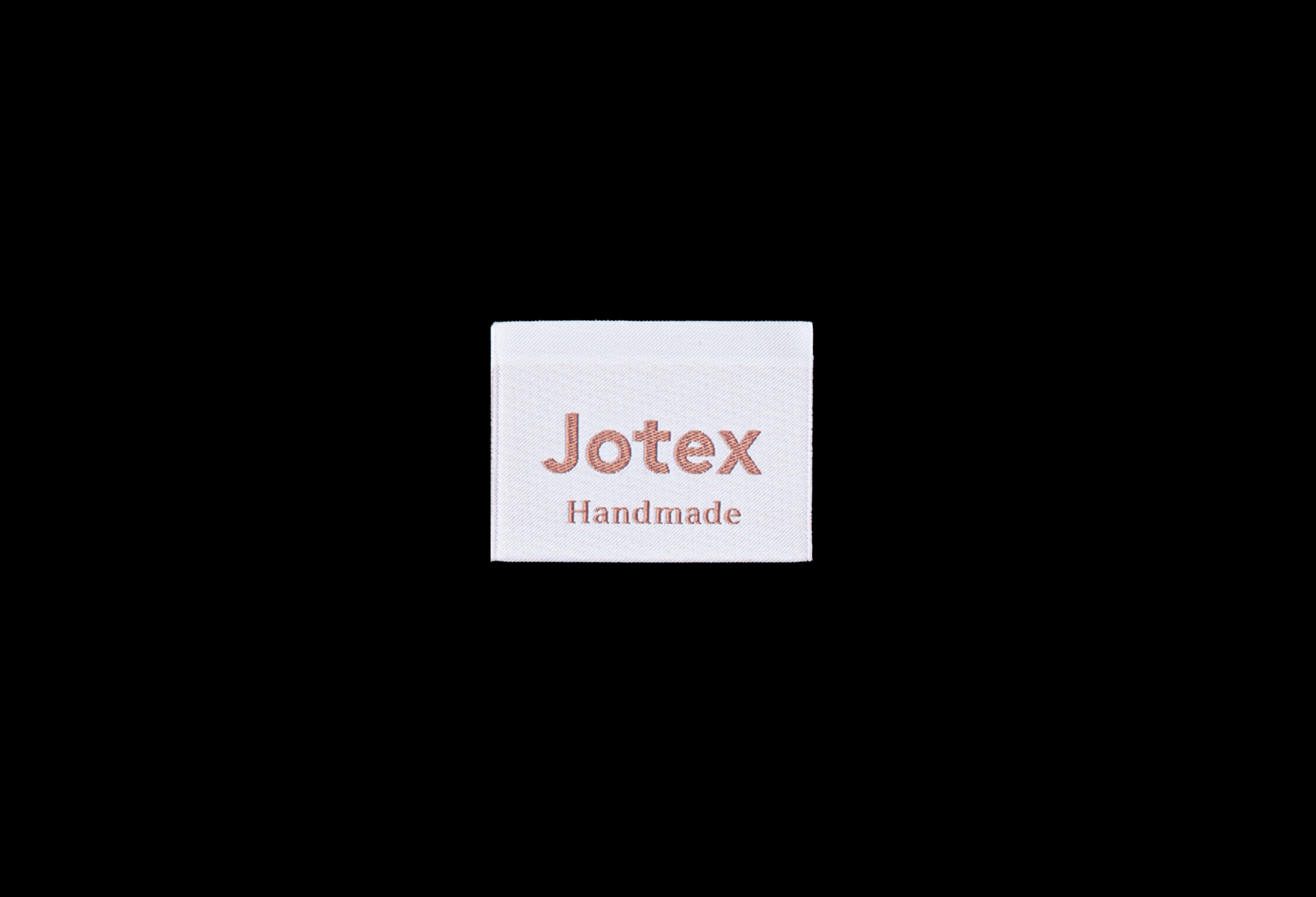
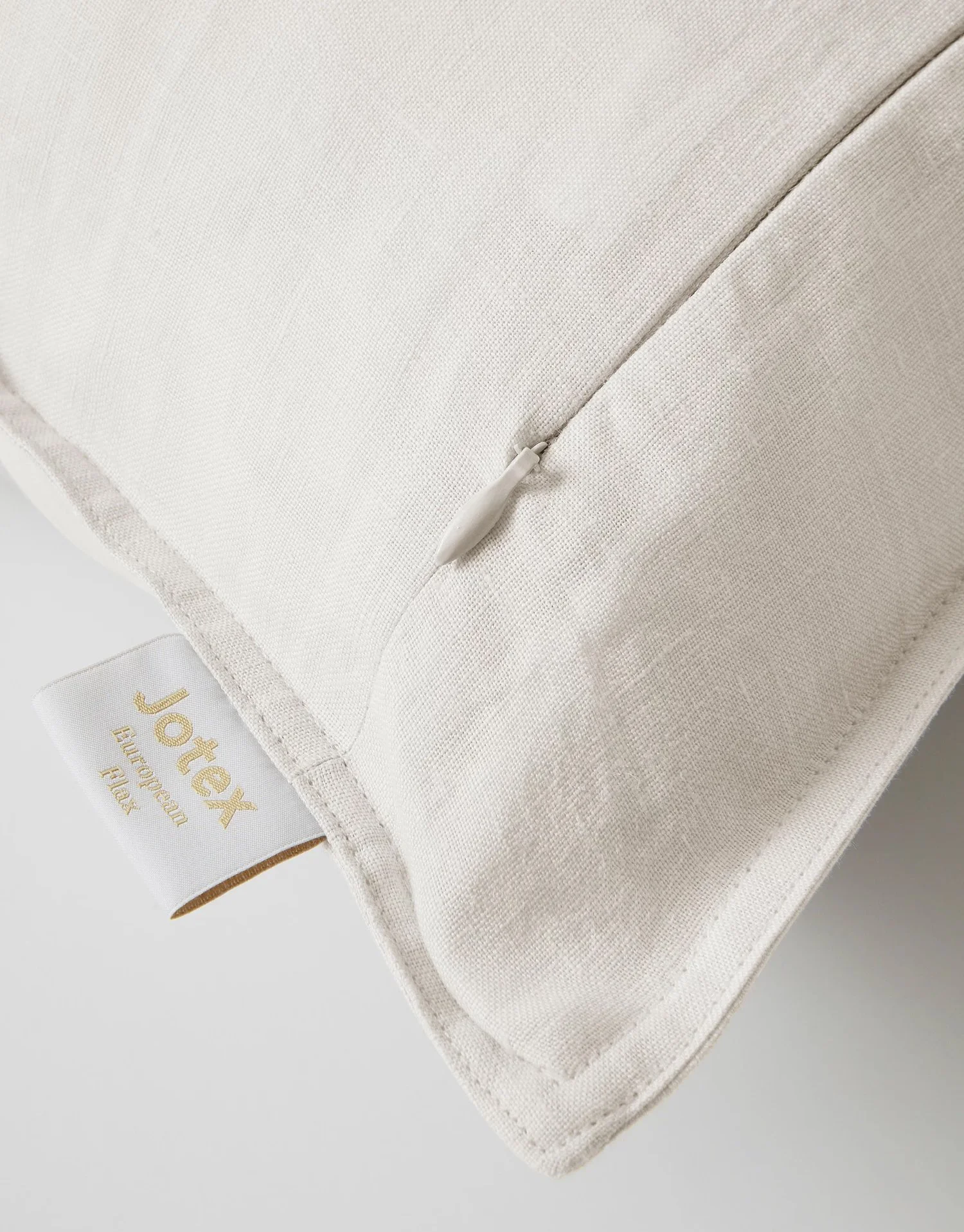
To complement their colorful and often patterned textiles, we designed a distinct color system that harmonizes with most products. Additionally, we introduced a complimentary, more sober, serif typeface for use across categories — appearing on labels, stickers, hangtags, and more. The scope also included several Positioning Guidelines Manuals, sampling materials, and printed collateral, developed in close collaboration with suppliers.
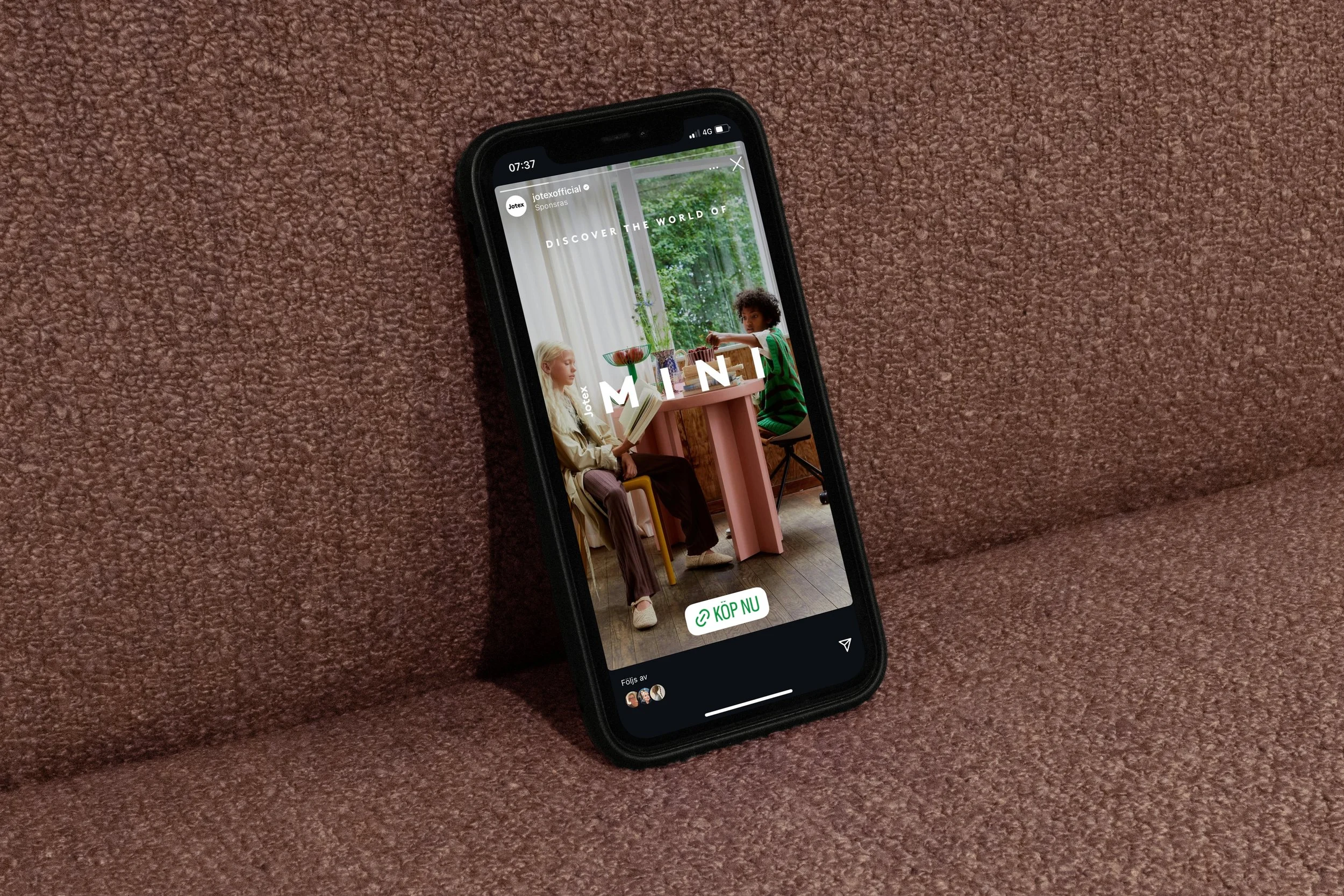
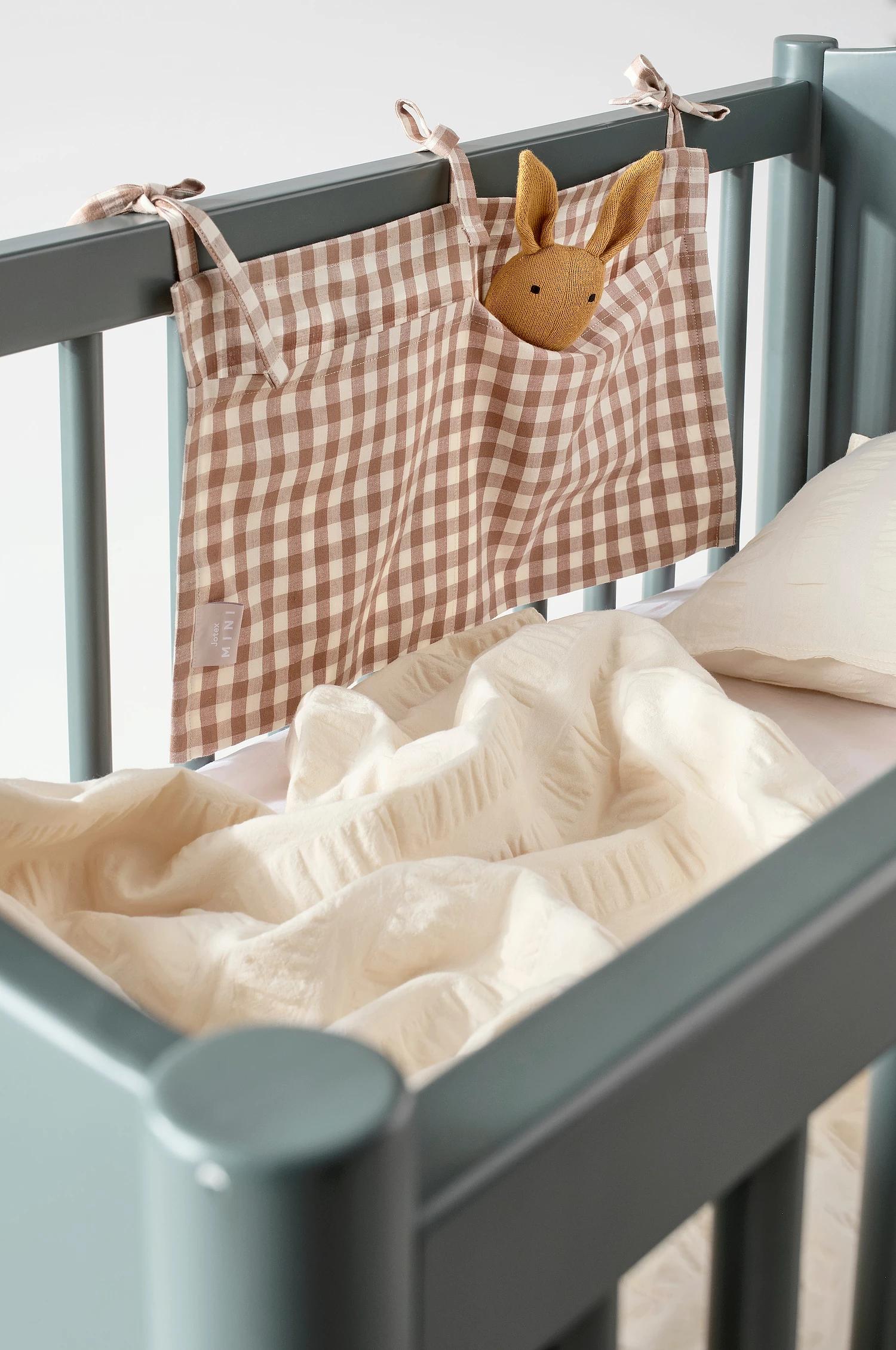
Interior & product photography by Jotex