Scope
Editorial, Set Design, Photography, Retouch
The Washington Post Magazine
Favorites Issue — Editorial & Set Design
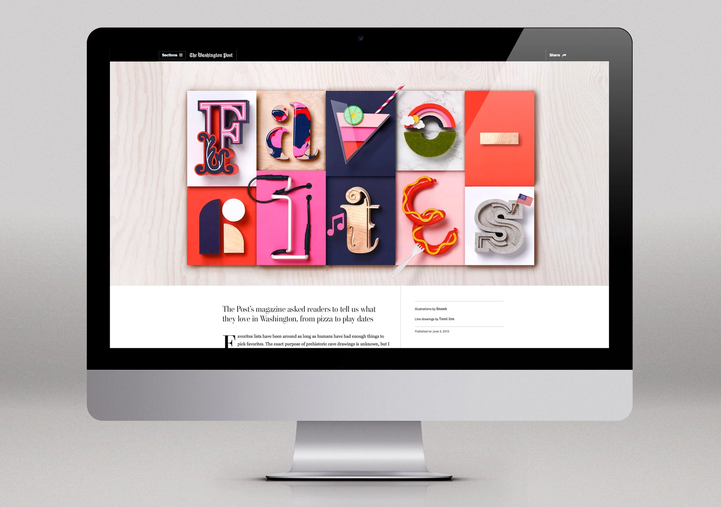
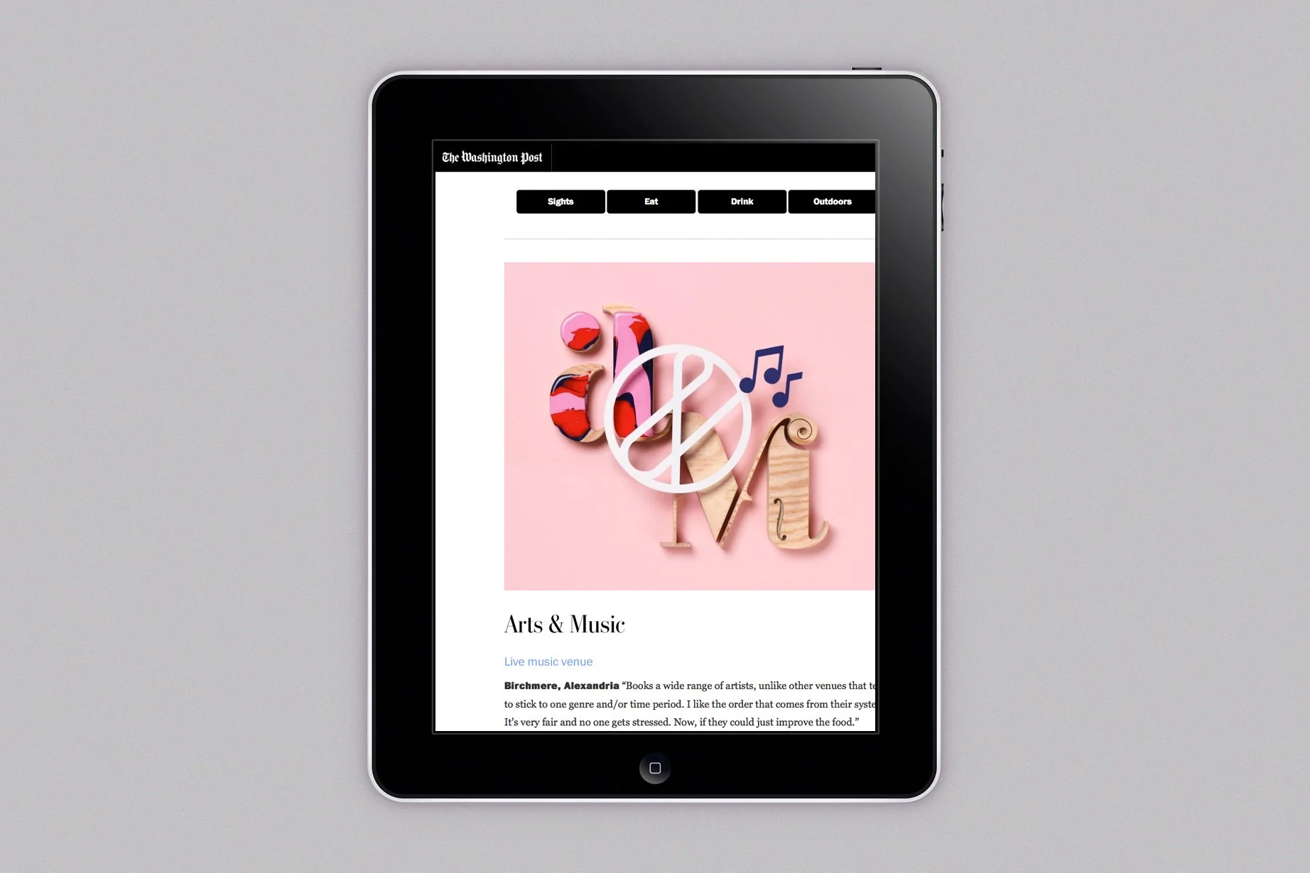
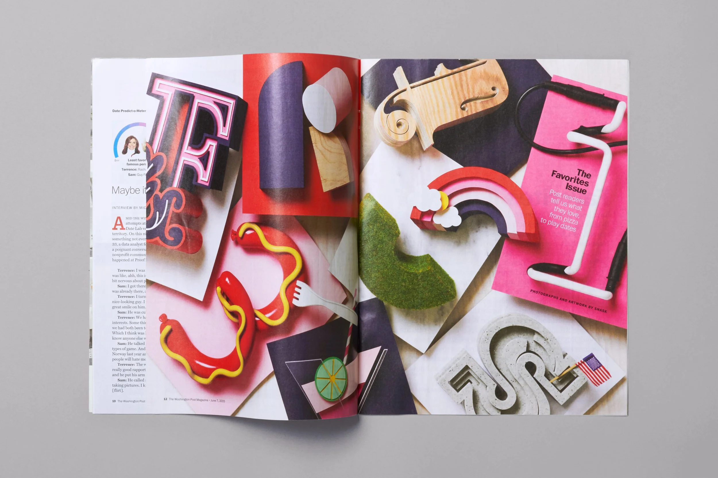
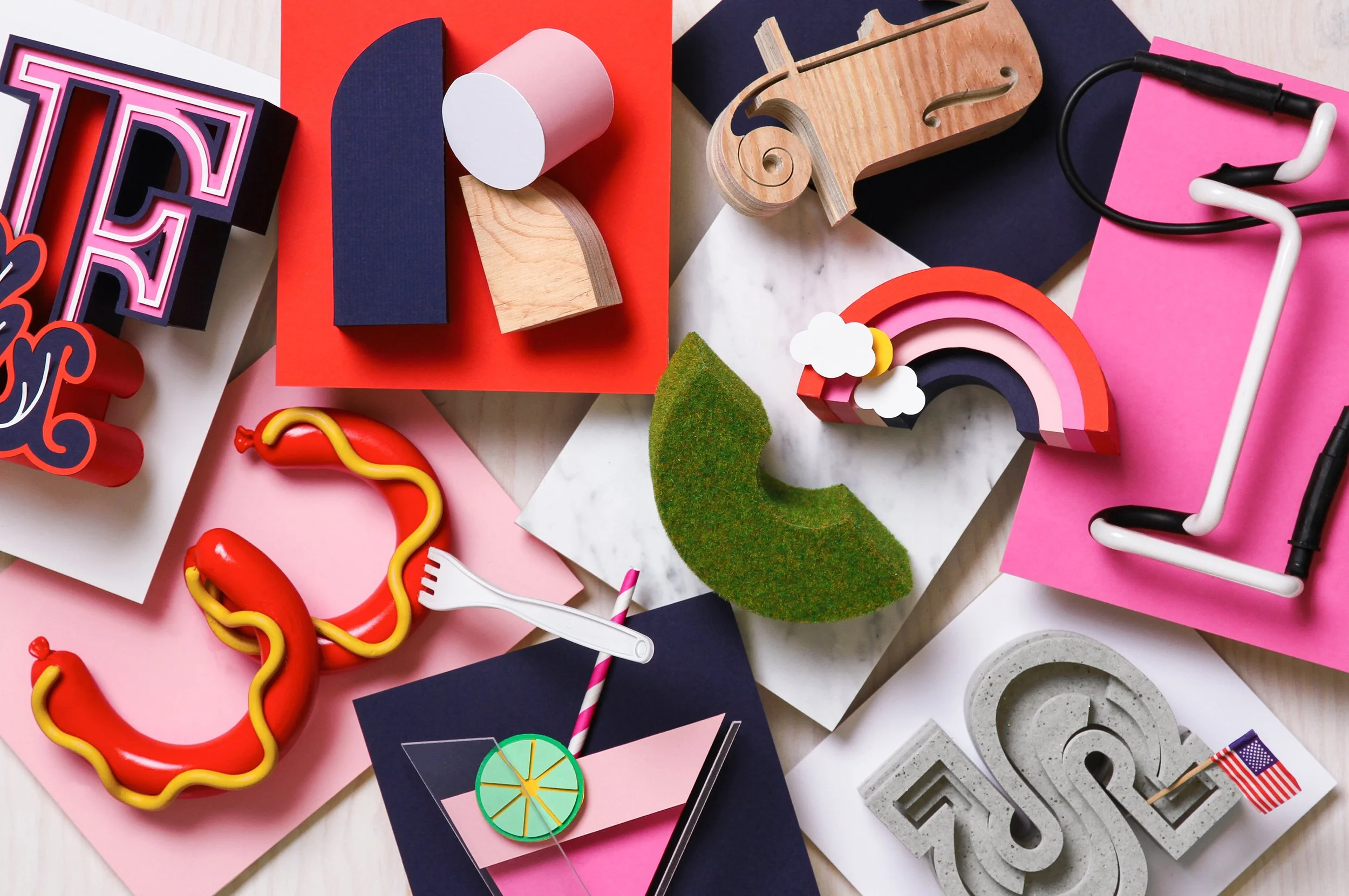
For the Favorites Issue, The Washington Post was looking for a more tactile and physical interpretation of its content. When receiving the assignment, it was chosen early on to move away from digital illustration and instead build everything by hand. Each letter in the word FAVORITES was constructed as a physical object, shaped around one of the issue’s themes — Eating, Drinking, Music, Arts, Sights, and others. They were treated as small sculptures rather than graphics.
Materials became the vocabulary. A glass Art Deco form suggested the elegance of a cocktail for Drinking. Concrete conveyed the weight and solidity of Sights. Clay, plywood, neon — every surface was selected to express a tone, an atmosphere, a cultural reference rather than a literal depiction.
The final series was photographed and used throughout the feature, both in the printed magazine and across The Washington Post’s online publication. The result felt tactile, imperfect, and human — an editorial identity you could almost touch.